
Every client tells me their site "looks great on mobile" the same way every driver tells me they're an above-average driver. Then I pick up their phone, tap the number in the header, and nothing happens. It's just text. I ask how many people have tried to call from that page and gotten the same nothing, and the room goes quiet. Mobile-first isn't a design trend anymore — it's the version of your site Google actually judges you on, and the version most of your customers are stuck using with one thumb while walking to their car. Let's fix the gap between "fits on a phone" and "actually built for one."
The short version
- "Responsive" isn't "mobile-first." Shrinking a desktop layout to fit a screen is not the same as designing for how someone actually uses a phone.
- Google only sees your mobile version. Its own documentation confirms indexing and ranking run off the smartphone-crawled version of your site — a broken mobile page is a broken site, full stop.
- Six specific spots quietly lose phone customers: tap targets, click-to-call, the menu, forms, checkout/contact friction, and layout that clips on small screens.
- You can self-test this tonight with your own phone and Google Search Console — no tools to buy.
Is your site mobile-friendly, or does it just fit on the screen?
Fitting on the screen means nothing overflows and the text isn't tiny — that's the bare minimum, and most site builders get you there automatically. Mobile-first means the phone experience was the priority, not an afterthought: buttons a thumb can actually hit, a phone number that dials on tap, forms that don't fight you, and nothing important buried three menu taps deep. Most small-business sites clear the first bar and fail the second.
The difference matters because "it fits" is a cosmetic pass and "mobile-first" is a functional one. A site can look perfectly tidy on a phone screenshot and still lose the sale the moment someone tries to actually use it — tap something, type something, find the phone number under a thumb that's holding a coffee.
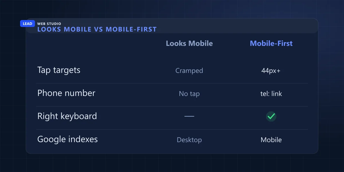
| What phones see | Just fits the screen | Actually mobile-first |
|---|---|---|
| Buttons & links | Cramped, easy to mis-tap | 44px+ finger-friendly targets |
| Your phone number | Plain text, no action | tel: link — dials on one tap |
| Main navigation | Contact buried under 2-3 taps | Call/quote button always visible |
| Contact form | Same desktop keyboard for everything | Right keyboard per field — numeric, email |
| What Google indexes | Assumes the desktop version | The mobile version, period |
What "mobile-first indexing" actually means for your ranking
Mobile-first indexing means Google crawls and ranks your site using its mobile version, not the desktop one — even for people searching on a desktop computer. Google says it plainly in its own documentation: it uses the mobile version of a site's content, crawled with the smartphone agent, for indexing and ranking.
This is the part that catches business owners off guard. If your mobile menu hides a chunk of your services, or your mobile page loads a stripped-down version of your content to save space, that's not a mobile-only cosmetic problem — that's the version Google is grading your entire site on. I've seen sites where the desktop version is a genuinely strong, keyword-rich page, and the mobile version (built by a different template, or a plugin trying to "simplify" things) quietly drops half that content. Google never sees the good version. Read the details straight from Google's mobile-first indexing documentation if you want the source, not my paraphrase.
You can have the best desktop website in your industry and it won't save you, because Google isn't grading that one. It's grading the phone in your customer's pocket.
The six places phone visitors quietly leave
None of these show up as a dramatic "site is down" moment — they're small frictions that just make someone give up and call the next name on the list instead. I see the same six on almost every audit I run.
- Tap targets too small or too close together. A thumb isn't a mouse cursor. Buttons under about 44 pixels, or packed edge-to-edge, get mis-tapped — and a mis-tapped "Call Now" that opens the wrong thing is worse than no button at all.
- The phone number isn't actually clickable. If it's styled as text instead of a real
tel:link, a phone visitor has to manually copy, switch apps, and dial — most won't bother. This is the single most common thing I find and the easiest to fix. - The call-to-action is buried in the hamburger menu. If "Contact" or "Get a Quote" only appears after opening the menu, you've added a step most people on a job site or in a parking lot won't take.
- Forms fight the phone's own keyboard. A phone-number field that pulls up letters instead of a numeric pad, or a form with no autofill support, turns a 20-second job into a frustrating one.
- Checkout or contact forms are too long for a thumb. Every extra field is a small tax on a small screen. What's a mild annoyance on a laptop becomes a real reason to bail on mobile.
- Content clips, overlaps, or requires horizontal scrolling. Usually a leftover desktop layout — a fixed-width table, a background image with text baked in, a two-column block that never collapses — and it reads as "this business doesn't take care of their stuff."
Quick self-test: check your own site tonight
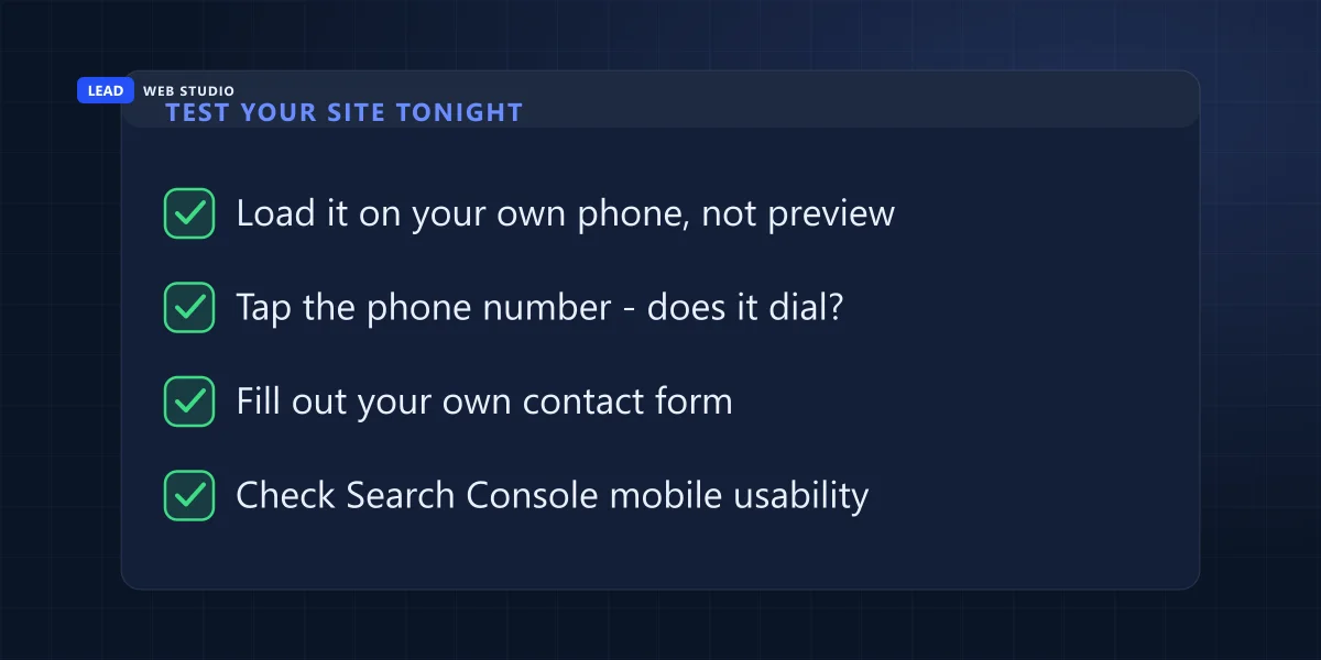
You don't need a subscription tool for this. Grab your own phone, turn off Wi-Fi so you're on real cellular data, and go through your site the way a stressed customer would: fast, distracted, one thumb.
- Load your homepage on your own phone — not a "mobile preview" toggle in a desktop browser, the real thing on real data.
- Tap the phone number wherever it appears. It should dial immediately. If it doesn't, that's priority #1.
- Fill out your own contact form, start to finish, with one thumb. Note every field that annoyed you.
- Try to reach your main call-to-action using only the thumb of the hand holding the phone — no repositioning.
- Open Google Search Console and check the Mobile Usability report (under Experience) for anything Google is already flagging.
What actually fixes it — and what it costs
Most of the six problems above aren't expensive to fix in isolation — a broken tel: link is a five-minute change. What costs money is when the underlying template or platform simply wasn't built mobile-first, and every fix is a workaround on top of a workaround. That's usually the point where patching stops being worth it.
| Situation | Fix | Rough cost |
|---|---|---|
| Phone number not clickable, small tap targets | Template/CSS tweaks | $0–$200 (quick job) |
| Menu buries the CTA, forms fight keyboards | Targeted UX rework | $200–$600 |
| Whole template isn't mobile-first at its core | Rebuild on a mobile-first foundation | $900+ (see redesign guide) |
If you're not sure which bucket you're in, that's exactly what a web design review is for — and if you're already weighing a bigger rebuild, I laid out the full decision framework in when a redesign is actually worth it versus when it's a waste of money.
Why this matters even if "most" of your traffic is desktop
Canada's overall traffic split is closer than the "mobile dominates everything" headlines suggest — StatCounter puts it at roughly 55% desktop to 42% mobile nationally as of mid-2026. So no, mobile isn't automatically the majority of your visitors. But two things change the math for a local service business: urgent, "I need this now" searches — a leaking pipe, a same-day quote — skew heavily toward whoever's holding a phone at that moment, and losing even a slice of a 42% share to an unclickable phone number is real, countable leads walking to a competitor. A home-services or urgent-need business, like the ones I build for in HVAC web design, lives or dies on exactly this moment.
If you only do one thing this week: open your site on your own phone and tap your own phone number. If nothing happens, that's a customer lost every single time it happens — and it's usually a five-minute fix.
Frequently asked questions
What does mobile-first actually mean for a website?+
It means the mobile version of your site is the real version — the one Google crawls and ranks, and the one most of your visitors use. A responsive site that merely shrinks to fit a phone isn't the same thing as a site designed mobile-first.
Does Google actually only look at my mobile site?+
Yes. Google's own documentation states it uses the mobile version of a site's content, crawled with the smartphone agent, for indexing and ranking. If your mobile version is missing content or broken, that's what Google sees, regardless of how good your desktop site looks.
How do I check if my site is mobile-friendly?+
Open it on your own phone over cellular data, not a browser preview mode. Try tapping the phone number, filling in the contact form, and using the menu with one thumb. Then check the Mobile Usability report inside Google Search Console for anything Google is flagging.
Is mobile traffic really that big a deal for a small business?+
It doesn't need to be a majority to matter. Roughly 42% of Canadian web traffic is mobile, and for local, urgent searches like a service call or a same-day booking that share runs higher. Losing even a slice of that to a broken form or an unclickable phone number is real money.
Want your site checked against all six?
I'll run your site through the same phone-in-hand test I use on every client audit — free, no pressure, just the honest list of what's costing you calls.
Get My Free Quote
10+ years building mobile-first websites for GTA businesses — the kind that actually get tapped, called, and booked. Read my full bio · Get in touch