Instant screen switching
Ten screens live in one document and toggle without a page load, so the site feels like software rather than a series of pages.
A pool contractor’s site built to behave like a phone app instead of a website — ten tap-through screens, bilingual English/French, quote requests with photos, and invoicing. The concept, visual design and content are the client’s own; my role was development and technical support.
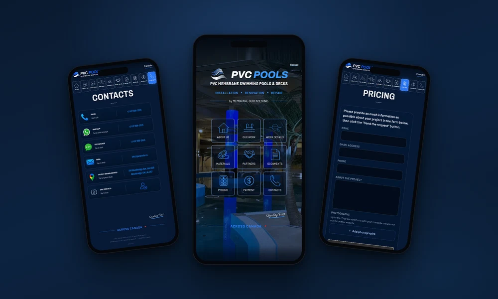
Pool membrane work is sold in the field, not at a desk. The owners are on site with a phone in hand, and so are their customers — standing next to a pool, taking photos of a leak, asking what it will cost. A conventional multi-page website is the wrong shape for that conversation.
The client had already decided what he wanted: something that opens like an app, not like a brochure. He designed it and wrote every word himself, in two languages. What he needed was someone to turn that into a real, production-grade site that behaves correctly on every phone and does the working parts — quotes, documents, invoicing — properly.
A swimming pool contractor in Woodbridge, Ontario working Canada-wide. The site is a phone-app style website: one document, ten tap-through screens, English/French switching, a quote form that accepts up to six photos, PDF invoicing and Interac e-Transfer details, plus a document viewer for certificates. Concept, design and content are the client’s; Lead Web Studio did the development and technical support. A hand-coded build of this scope is $899–$2,999 one-time. The live site is at this link.
Every screen is already in the browser when the page loads, so tapping a tile switches views instantly with nothing to wait for. On a desktop monitor the whole interface becomes a centred phone panel that keeps its proportions rather than stretching into a layout it was never designed for.
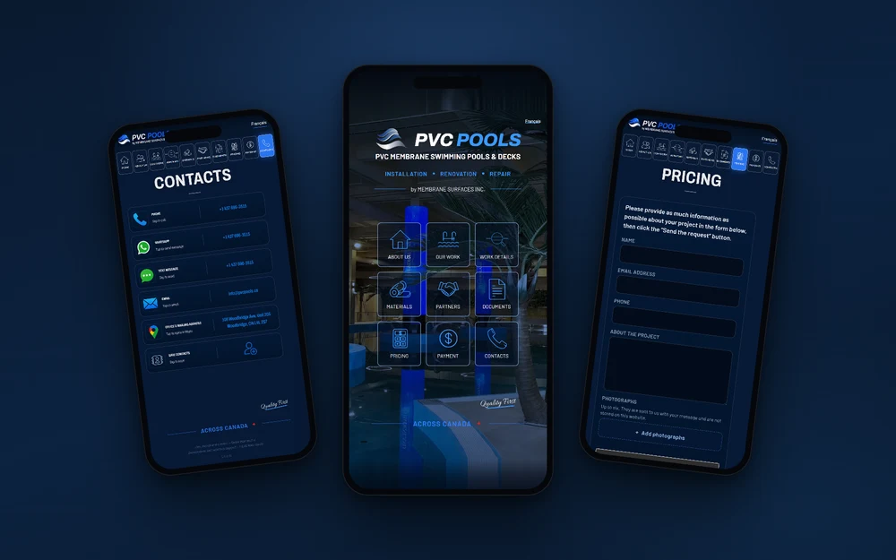
An app-style shell is easy to fake with animation. What makes it useful is that the buttons actually do something.
Ten screens live in one document and toggle without a page load, so the site feels like software rather than a series of pages.
Both languages ship in the same document and swap the entire interface on one tap — no second site to maintain and nothing left half-translated.
A customer standing at the pool can describe the job and attach up to six photographs straight from the phone, which is how this trade is actually quoted.
An invoice can be requested from the site and arrives as a PDF by email, with Interac e-Transfer details presented as the preferred way to pay.
Company registration and installer certificates open as real documents from inside the app, so a customer can verify the company without leaving the screen.
Call, WhatsApp, SMS, email, Maps and save-to-contacts are single taps that hand off to the phone’s own apps instead of asking anyone to copy a number.
This shape suits a business whose customers arrive from a phone, already know who they are calling, and need to do one thing quickly: get a quote, check a credential, pay an invoice. Field trades, mobile services and referral-driven businesses fit it well.
It is the wrong shape if the plan is to win customers from Google search. A single document with one URL gives search engines one page to rank, not thirty, and no separate address for each service or city. That trade-off was the client’s deliberate choice here — the business runs on referrals and direct contact, not on organic search.
If search traffic matters to you, a conventional multi-page build is the better answer, and I will say so before quoting. The two approaches are not interchangeable and pretending otherwise costs you either rankings or usability. What that second shape looks like for this trade is set out on swimming pool company website design, and city by city on pool company web design in Vaughan.
The same as any hand-coded build of similar scope — $899 to $2,999 one-time depending on the number of screens and the working parts. Forms, PDF invoicing and payment handling add to it; a straight brochure does not.
No, and that is the point. It is a website that behaves like an app, so there is nothing to install, nothing to submit to an app store, and no update to push. A customer opens a link and it works.
It stays a phone. Above a certain width the interface becomes a centred panel that keeps its phone proportions instead of stretching, so the layout never breaks into something it was not designed for.
Only for a narrow set of terms. One document means one page for search engines to index, so there is no separate page per service or city. If ranking matters, a multi-page build is the right choice — see SEO plans for how that side works.
Yes. Here both English and French ship in the same document and swap on one tap, which keeps one site to maintain instead of two that drift apart.
Tell me how your customers actually reach you and I will tell you which shape fits — see my website design packages from $899.
For a planning session or on-site business photos, I'll come to you. Pick your city: