A client once asked me to open his homepage with a 600-word "Our Story" — how his grandfather started the business, the years they weathered, the values that guide them to this day. Genuinely lovely writing. Wrong place for it. A visitor lands on your homepage because they have a leaking pipe or a rash or a roof that's about to become a swimming pool, and the first thing you show them is a family saga they'd have to scroll past to find your phone number. That's not a homepage. That's a eulogy with a "Get a Quote" button buried somewhere in Act Three. Let's talk about what actually belongs up there, in what order, and why most homepages get it backwards.
The short version
- A visitor judges your homepage's visual appeal within about 50 milliseconds — long before they read a word of it.
- The five things that have to work: a clear headline (what/who/where), one obvious call to action, visible proof (reviews, years, real photos), a services overview linking to your money pages, and a fast load.
- Full team bios, a scrolling blog feed, a detailed history — all real, all valuable, none of them belong on the homepage. They belong on their own pages, one click away.
- Every homepage decision should pass one test: does this help a stranger understand what I do and act on it, or does it just make me feel thorough?
What should actually be on a service-business homepage?
A service-business homepage needs five things doing real work: a headline stating what you do and where, one obvious call to action, visible proof you're legitimate — reviews, years in business, real photos of real jobs — a short services overview that links out to your actual service pages, and a page that loads fast enough that nobody has time to change their mind. Everything else — long history, full staff bios, a blog feed — belongs on its own page, one click away, not competing for the same six seconds of attention.
How fast do people actually judge your homepage?
Faster than you can read this sentence. A landmark study by Gitte Lindgaard and colleagues found that people form a lasting opinion of a webpage's visual appeal in as little as 50 milliseconds — and that first snap judgment barely moves even when they're given far longer to look. The Nielsen Norman Group, whose research on first impressions cites the same study, put it plainly: the aesthetic call is made about ten times faster than it takes to actually read anything on the page.
What that means practically: nobody is reading your "Our Story" before they decide whether to stay. They're reacting to layout, whitespace, and whether the page looks like it belongs to a real, competent business — and only then, if the vibe passes, do they start reading. Your job on a homepage isn't to convince someone with paragraphs. It's to not lose them before the paragraphs even get a chance.
Nobody decides to trust your business by reading your homepage. They decide in under a second, then look for evidence to confirm it. Give them the evidence fast.
The homepage anatomy, top to bottom
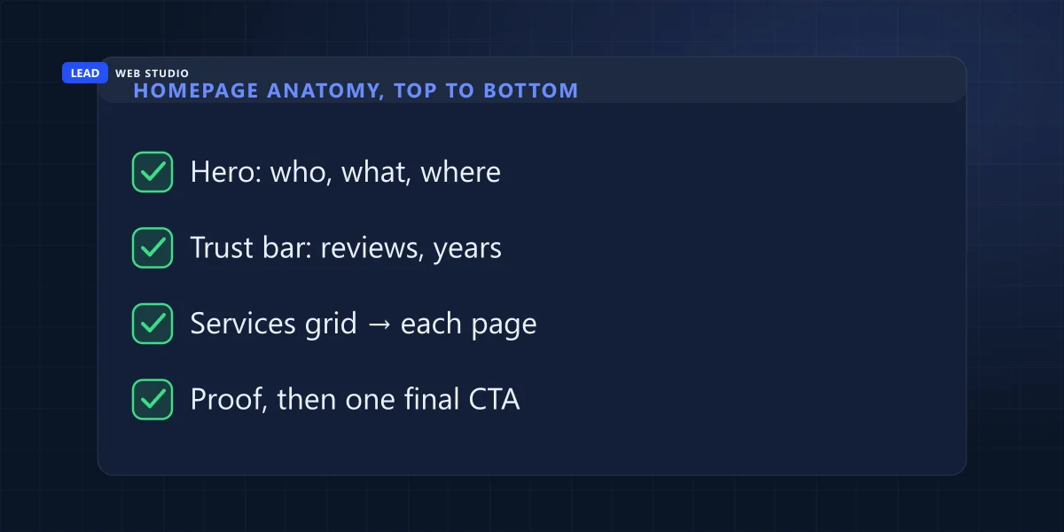
This is the order I build in, for almost every trade, clinic, law firm or shop I work with. Not because it's the only way — because it matches how someone actually reads a page they've never seen before, top to bottom, fastest decisions first.
- Header, always visible. Logo, a phone number that's an actual
tel:link, and one call-to-action button. This travels with the visitor down the whole page — it's the safety net for anyone who decides to act on paragraph one instead of scrolling further. - Hero section. One headline that says what you do, who it's for, and where — "Licensed Plumbers Serving Toronto & the GTA," not "Welcome to Our Website." A one-line subhead, a real photo (your crew, your storefront, your actual work — never a stock photo of a stranger in a hard hat), and one primary button.
- Trust bar. A thin strip right under the hero: star rating, review count, years in business, any real certifications or associations. This is the fastest proof block on the page and it should show up before anyone scrolls.
- Services overview. Three to six tiles, each one a real service with a short line and a link to its own page. This is where your money pages actually get their traffic — the homepage's job here is to sort the visitor, not explain everything itself. One line of pricing belongs in this block too, and deciding what that line says is its own decision.
- Why choose us. Three or four honest differentiators — response time, licensing, warranty, local ownership. Skip the generic "quality and integrity" filler; if it could sit on any competitor's site unchanged, it's not a differentiator.
- Social proof. A handful of real reviews or one short case snippet. Quotes with real names beat a wall of five-star icons with no words attached.
- How it works. Three or four steps showing what happens after someone contacts you. This one section quietly kills more hesitation than any other, because it removes the fear of the unknown.
- Final call to action. One more clear, low-friction way to act — call, book, or a short form. Not a fifth different offer; the same one, repeated, because most people who convert do it on the second or third ask, not the first.
- Footer. Name, address, phone, hours, service area, and links to the pages that don't belong up top — full bio, full blog, privacy policy. This is where thoroughness goes to live.
What doesn't belong on your homepage (and where it actually goes)
None of the content below is bad — it's just in the wrong place. Every one of these belongs on its own page, one click away, where someone who's already interested can go looking for it on purpose.
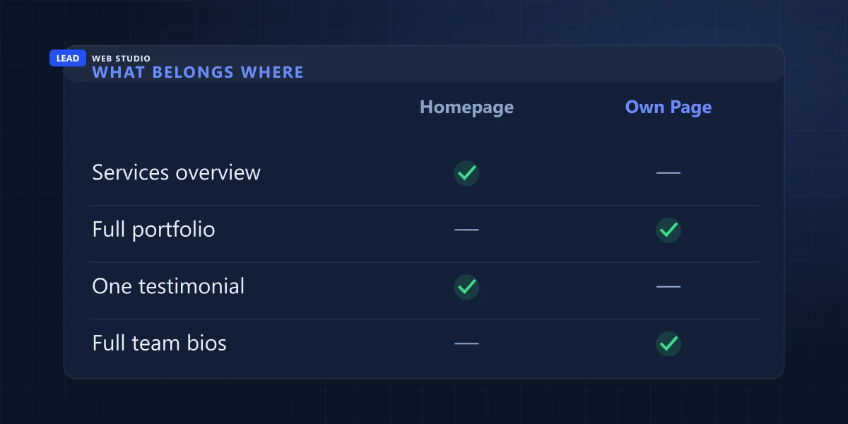
| Content | Belongs on the homepage? | Where it actually goes |
|---|---|---|
| Full company history / "Our Story" | No | Your About page |
| Every team member's bio & headshot | No | A dedicated Team or About page |
| A scrolling blog feed | No | Two or three latest links only; the rest on Articles |
| Full price list / rate card | No | Your Pricing page |
| One clear services overview | Yes | Homepage, linking out to each service page |
| A handful of real reviews | Yes | Homepage trust bar & social proof section |
The 10-second squint test
This is the self-audit I actually run on client homepages, and you can run it on yours right now, for free, before you touch anything else:
- Open your homepage on your phone, hold it at arm's length, and squint until the text blurs.
- Can you still tell, from shapes and colour alone, where the headline is and where the button is? If everything blurs into the same grey block, there's no hierarchy.
- Now read normally for exactly 10 seconds, then look away. Can you say out loud what the business does and what city it's in?
- Scroll to the bottom without reading. Is there a second, equally obvious way to get in touch?
- Ask someone who's never seen your business to do steps 1–4 and watch where their eyes actually go — it's rarely where you expect.
If your homepage survives that test, the anatomy above is mostly a formatting exercise. If it doesn't, that's exactly what a free website audit catches — nine times out of ten it's not a design problem, it's an ordering problem.
The pattern I see constantly
Almost every homepage rebuild I take on has the same two mistakes, in some combination. First: the "About Us essay" problem from the top of this post — real, well-written content, positioned as if it's the first thing a stranger needs from you. Second, and sneakier: the phone number exists somewhere on the page, technically, but it's plain text in the footer instead of a tappable button near the top. On mobile — where most local searches happen — that's the difference between a call and a bounce. Neither mistake comes from a bad business. They come from writing the homepage in the order you'd explain your business to a friend, instead of the order a stranger needs it explained to them.
How this connects to SEO and to actually converting
A well-ordered homepage isn't just a UX nicety — it's half of the split I wrote about in the honest guide to a website that ranks and converts: most small-business sites are quietly built for only one of those two jobs. Getting the anatomy right handles the conversion half. And because it's usually leaner and lighter than a homepage stuffed with everything at once, it also tends to load faster — which matters for both rankings and patience, as I covered in Core Web Vitals for a small business. If what you actually need is one focused page for a single campaign rather than a full homepage, that's a different job entirely — see website vs. landing page for where that line sits.
If you only fix one thing this week: look at what's above the fold on your own homepage right now. If it isn't a headline, a phone number, and one button, move those three things up — everything else can wait its turn.
Frequently asked questions
What is the most important thing on a homepage?+
A headline that tells a visitor what you do, who it's for, and where, paired with one obvious call to action. If someone can't answer "what is this and what do I do next" within a couple of seconds, nothing else matters yet.
Should my homepage have a blog feed on it?+
No, not a full feed. Link two or three newest articles as a small section — the full blog belongs on its own page, linked clearly from the homepage.
How long should a service-business homepage be?+
Long enough to cover the anatomy — hero, trust bar, services, differentiators, proof, process, final call to action — usually six to nine sections. There's no minimum word count; every section has to earn its place.
Do I need a hero video on my homepage?+
No. A real photo loads faster and tells the truth immediately. A video can work further down the page as supporting proof, not as the first thing a visitor has to sit through.
What if my business genuinely doesn't fit this template?+
The order can flex — a restaurant leads with food photos, a law firm leans harder on credentials — but the job stays the same: say what you do, prove it's true, make the next step obvious.
Not sure your homepage passes the squint test?
I build homepages around this exact anatomy — fast, SEO-ready web design that says what you do and gets the phone to ring. Free review to start.
Get My Free Quote
10+ years building homepages that get read, trusted, and clicked — for trades, clinics, and everything in between. Read my full bio · Get in touch