Owners ask me why the contact form brings in two messages a month when the phone rings every day. Usually the form works fine on my laptop. Then I open it on my phone with my thumb, and it turns into a small obstacle course. So this morning I opened the contact pages of 38 Ontario roofers and clinics on an iPhone-sized screen and read every form field by field. I typed nothing and sent nothing. 24 of them had a form I could read, and almost every one had at least one of the same few mistakes.
What are the most common contact form mistakes on a phone?
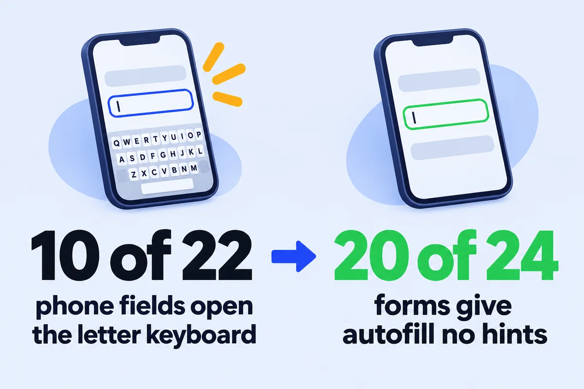
On the 24 forms I read, the common mistakes were small and technical: a phone field that opens the letter keyboard, no hints for autofill, field names written only in grey placeholder text, text small enough that iPhone zooms in, and a form that starts a few screens down the page. None of them shows on a desktop.
| What I found | Forms | What the person on the phone gets |
|---|---|---|
| Phone field opens letters, not the number pad | 10 of 22 | Switches keyboards to type ten digits |
| No autofill hint on name, email or phone | 20 of 24 | Types everything by hand, typos included |
| Field names only in grey placeholder text | 11 of 24 | The name of the field vanishes at the first letter |
| Field text smaller than 16px | 12 of 24 | iPhone zooms in on every tap |
| Form starts below the first screen | 13 of 24 | Has to know the form exists and scroll to it |
| Nothing marked as required | 3 of 24 | Can send a message with no way to reply |
The good news first: 21 of 24 email fields were set up as email fields, 21 forms had some spam check, and only 3 contact pages had no number you could tap to call. The basics are there. What's missing is the last ten percent that decides whether a person on a bus finishes the thing.
How I read the 24 forms
- The sites
- 16 roofers and 22 clinics from my earlier research on what roofing websites hold and on clinic booking buttons. 37 opened; 24 had a form my reader could see. Several clinics take bookings only through their booking system, so they have no form at all, which is a fine choice.
- The screen
- An iPhone 13 size (390 by 844 points) in Chromium, with every tracker blocked so I didn't count as a visit in anyone's analytics.
- What I read
- Each visible field: its type, its autocomplete value, whether a label is tied to it, its text size, whether it's required, plus where the form starts and which spam check the page loads.
- What I didn't do
- Type into a field or press Send. Nobody got a test message from me.
I'm not naming the businesses. Most of these forms were built by a theme or a form plugin with its default settings, and the owner has never seen them on a phone. That's the whole point.
Why does my phone field open the letter keyboard?
Because the field is built as a plain text field. A phone number field should be type="tel", which tells the phone to show the number pad. Of the 22 forms that ask for a phone number, 12 use tel, 8 use plain text and 2 use type="number", which brings its own problems. It's a one-word fix.
<input type="text"
  name="phone"
  placeholder="Phone">
Letter keyboard. The visitor taps 123 to switch, types the area code, and the field forgets what it was for.
<label for="phone">Phone</label>
<input type="tel" id="phone"
  name="phone"
  autocomplete="tel">
Number pad opens, the phone offers the owner's own number, and the word Phone stays above the box.
The type="number" version looks clever and isn't. MDN, the reference most web developers work from, says number is for quantities and is "not appropriate for values that happen to only consist of numbers". It comes with up and down arrows meant for counting, and on a desktop a scroll of the mouse wheel can change a digit. Nobody wants their phone number incremented by one.
The autofill hint that only 4 of 24 forms had
Your phone already knows your name, email and number, and it fills a form in two taps if the form tells it which box is which. That's the autocomplete attribute. Only 4 of 24 forms had a usable hint on the name, email or phone field. One clinic form had it switched off on purpose for every field.
<input type="email" id="email" name="email" autocomplete="email" required>- The type opens a keyboard with the @ sign and checks the format. 21 of 24 forms already do this part.
- The autocomplete value lets the phone offer the visitor's saved address. 4 forms had it.
- The required flag stops a message being sent without a way to reply. 3 forms mark no field as required at all.
The names to use are fixed and written down: name for the full name, email, tel, postal-code, address-level2 for the city. MDN also notes that correct autocomplete values help people with cognitive and motor disabilities, and they're part of WCAG 2.2 criterion 1.3.5, so this one fix counts for accessibility as well. The person typing their email with one thumb in a parking lot gets the same benefit.
Grey placeholder text is not a label
In 11 of the 24 forms, no text field had a label tied to it. The name of each field lived only in the grey placeholder inside the box. Placeholder text disappears the moment you start typing, so the person filling the form loses the instructions exactly when they need them. Across all 24 forms, 81 of 136 text fields had no label the browser could connect to them.
What goes missing when the label is only a placeholder:
- The visitor halfway through "Address" can't check whether you wanted the street or the whole thing.
- When the browser autofills, every box is full and none of them says what it is any more.
- A screen reader has nothing reliable to read out for that box.
The fix costs nothing: a short visible label above each box. Keep the placeholder for an example if you like ("416 555 0199"), never for the name of the field.
Why the page zooms in when someone taps your form
On an iPhone, Safari zooms the whole page in when you tap a field whose text is smaller than 16 pixels. The visitor then has to pinch back out to see the Send button. 12 of the 24 forms had at least one field between 13 and 15.5 pixels. Setting the field text to 16px stops it.
"If the font-size of an <input> is 16px or larger, Safari on iOS will focus into the input normally. But as soon as the font-size is 15px or less, the viewport will zoom into that input."
Chris Coyier, CSS-Tricks
Some developers kill the zoom by switching off pinch-zoom for the whole page. Please don't. That takes zoom away from everyone who needs larger text, to fix a problem one line of CSS solves properly. Field text at 16px also reads better, which nobody has ever complained about.
Where does the form sit on the phone screen?
On 13 of the 24 sites the form starts below the first phone screen, and on 4 it starts more than three screens down. The deepest one began 5,118 pixels from the top, about six full screens of scrolling. On a desktop the same form sits in a sidebar next to the text, which is why nobody notices.
A form that deep isn't wrong in itself. It's a problem when nothing near the top tells the visitor it's there. What I do instead:
- Put the phone number and a short button ("Send a message") on the first screen of the contact page.
- Point that button at the form with an anchor, so one tap scrolls straight to it.
- Keep the map, the office photo and the opening hours below the form, not above it.
- Check the order on a phone, because a two-column desktop layout stacks in its own order on a narrow screen.
The forms near the top were also the short ones: the five forms that start within 700 pixels have 3 to 6 fields each. The longest form I found had 24 fields, most of them checkboxes for services. That one belongs in a phone call after the first message, not before it.
A five-minute test on your own phone
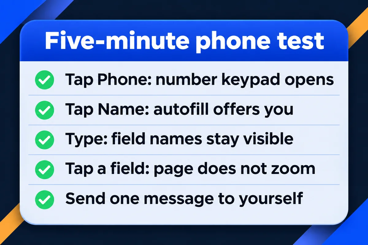
You don't need a developer to find these. Open your own contact page on your phone, the way a customer would, and go through it once. Each step has one right answer.
- Load the contact page and don't scroll.You should see the phone number and a way to the form.
- Tap the phone field.The number pad opens, not letters.
- Tap the name field.Your phone offers your own name and details above the keyboard.
- Type one letter in each box.You can still read what each box is for.
- Watch the page as you tap.It doesn't zoom in and leave the Send button off screen.
- Send a real message to yourself.It reaches your inbox, not spam, within a minute.
If step 6 fails, the form is the least of your worries: my guide on contact form emails going to spam covers where those messages go.
How I build contact forms now
My list for a form is the six steps above, run on a phone before the site goes live: tel and email types, autocomplete on every field it fits, visible labels, 16px field text, a short path from the top of the page, and one real message to my own inbox. After launch, my support plans include testing your contact form end to end every week. For trades I keep the form to a handful of fields on the roofing websites I design, because the real conversation happens on the phone anyway.
A form can also be perfect and still fill up with junk, which is a different problem with its own fixes in stopping contact form spam. And once messages arrive, you'll want to count them properly, which I go through in capturing leads on your website. The plans and what each one includes are on my pricing page.
Contact form questions owners ask me
How many fields should a contact form have?+
As many as you need to call back and nothing more. 13 of the 24 forms I read had 5 fields or fewer. For a trade, name, phone, email, town and a message is enough. Ask for the address and the details when you call, not in the first message.
Should the phone number be required on my form?+
If you reply by phone, yes, and say so next to the field. 15 of the 22 forms with a phone field require it. Just make sure the field is type tel, so filling it on a phone takes two seconds instead of a keyboard switch.
Is it bad to use placeholder text in a form?+
Placeholder text is fine as an example inside the box. It's a problem when it's the only name the field has, because it disappears as soon as someone types. 11 of 24 forms I read worked that way. Add a short visible label above each field.
Why does my website zoom in when I tap the form on an iPhone?+
Safari on iPhone zooms in when a field's text is smaller than 16 pixels. 12 of the 24 forms I checked had a field at 13 to 15.5 pixels. Set the font size of inputs, dropdowns and the message box to 16px and the zoom stops.
Can I check my contact form without sending a test message?+
You can check most of it: the keyboard, autofill, labels, zoom and position, just by tapping through it on your phone. Whether the message arrives can only be checked by sending one, so send it to yourself, never as a fake customer to a colleague's inbox.
Sources, read on 14 November 2026: MDN, input type tel; MDN, input type number; MDN, HTML attribute autocomplete; CSS-Tricks, 16px or larger text prevents iOS form zoom. Form data: 38 Ontario business sites opened at iPhone 13 size on 14 November 2026, 24 forms read, nothing typed or sent.
Want your form checked on a phone?
Send me the link to your contact page. I'll tell you which of these six mistakes it has and what each fix involves.
Get My Free Quote
I build hand-coded websites for small businesses around the GTA, contact forms included, and I look at every one of them on a phone. Read my full bio · Get in touch